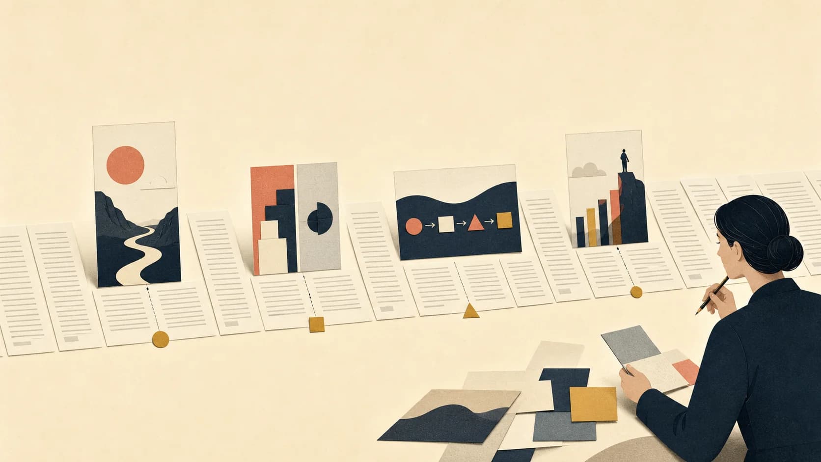
For a typical 900–1,500-word educational post, start with two to four useful images including the hero. Then adjust for page purpose and concept density: add an image only when it explains, compares, proves, or sets up something the text cannot do as efficiently.
Choose a starting image count and let Zyncli propose the ideas from your article. Review before generating. Planning and image generation use credits.
Plan images for my articleThe short answer: start with a planning range, not a quota
For a 900–1,500-word educational article, our editorial starting range is two to four images including the hero. This is a planning heuristic, not a measured ranking threshold or a Google requirement. A short opinion may need only one opening image. A detailed tutorial may need a screenshot or diagram for each meaningful step, so six or more can be reasonable.
Treat those numbers as a starting range, not an SEO rule. Search engines do not publish a preferred image-to-word ratio. The right number is the smallest set that helps a reader understand, trust, navigate, or remember the page. An image that repeats the adjacent sentence adds file weight and interruption without adding information.
The important distinction is between an image slot and a visual job. A slot says, “We have reached another 300 words.” A job says, “This comparison is hard to scan in prose,” or, “The reader needs to see the actual interface here.” The second approach produces a better article and a more coherent visual sequence. If you are planning illustrations rather than screenshots, see the complete article illustration workflow.
Why fixed image-to-word ratios fail
Published recommendations vary widely and should be treated as editorial advice, not evidence that a particular ratio improves rankings. Compare the approaches from Semrush and SEOWriting.ai, then decide which visual jobs your own draft actually needs to do.
Two 1,200-word articles can have completely different visual needs. A reflective essay may develop one sustained argument and need only a hero plus one conceptual illustration. A software setup guide of the same length may contain eight interface decisions that are safer to show than describe. A research summary may need charts for three findings but no decorative breaks at all.
Length affects the opportunity for images, but page purpose and concept density determine the need. Concept density means the number of distinct ideas, transitions, comparisons, steps, or claims a reader must hold in working memory. When that density rises, useful visuals usually rise with it. When the prose is linear and the idea is singular, adding images on a timer creates noise.
A practical image-count decision table
Use the table as a first-pass budget before reviewing the actual draft. The count includes the hero. After choosing a range, mark the specific paragraph or section each body image must serve. If you cannot name that job in one sentence, remove the slot.
| Article type | Typical length | Concept density | Starting range | Likely visual jobs |
|---|---|---|---|---|
| Opinion or announcement | 600–900 words | Low to medium | 1–2 images | Hero; one central contrast or argument |
| Educational explainer | 900–1,500 words | Medium | 2–4 images | Hero; concept; comparison; summary |
| Long-form guide | 1,500–2,500 words | Medium to high | 4–7 images | Hero; section concepts; process; evidence |
| Tutorial or case study | Any length | High | One per distinct step or evidence point | Screenshots; diagrams; before/after; result |
| Gallery or visual review | Any length | The visuals are the content | As many as the article can explain | Every image needs analysis or context |
Count visual jobs, not empty spaces
Read the complete draft once without thinking about decoration. On the second pass, mark only the moments where a visual changes the reader's experience. Combine adjacent marks when one image can do both jobs. Then choose the appropriate form: an editorial illustration for interpretation, a diagram for structure, a screenshot for interface truth, a chart for quantitative evidence, or a photograph for real-world context.
Illustrations are especially useful when the subject is abstract, emotional, or difficult to photograph. Their role is to interpret the argument rather than prove a factual claim. That is the boundary explained in What Is Editorial Illustration? Screenshots and charts are better when the reader needs exact evidence.
- Opening: establish the article's central tension or promise.
- Explanation: make an abstract mechanism, relationship, or hierarchy visible.
- Comparison: help the reader evaluate two or more options quickly.
- Process: show order, movement, dependencies, or a real interface step.
- Evidence: present a result, source, example, or observable product state.
- Transition: reset attention only when the article genuinely changes mode or subject.
Three real article plans with different image counts
The following examples come from Zyncli's own current editorial set. They are planning examples, not claims that a particular image count caused better rankings or engagement. Each count includes the hero image.
Our technology explainer uses two images: a broad opening scene and one body illustration for the human implication of the technology. The article has one sustained argument, so we chose one supporting visual moment.
Our workflow guide uses four images: a hero plus three product screenshots showing the finished set, article input, and proposed briefs. It also includes a video walkthrough.
Our consistency guide uses eight images: a hero, a private-style builder screenshot, and six conceptual style comparisons. These show different visual treatments, not a before-and-after product benchmark.



How to tell when a blog post has too many images
A post has too many images when the reader must repeatedly stop for visuals that do not change understanding. Repetition is the clearest warning sign: several images express the same metaphor, show nearly identical product states, or break one argument into decorative fragments. Keep the strongest version and let the prose continue.
Also check whether the article still has a readable rhythm on mobile. A dense stack of large landscape images can push every useful sentence below another screen of media. Captions should tell the reader why the image is present, not restate the alt text. If an image needs a long paragraph to justify its existence, the image brief is probably unclear.
Visual consistency matters as the count grows. Six individually attractive images can still make one article look assembled from unrelated campaigns. Reuse a stable palette, medium, composition logic, and level of abstraction, then vary the subject. The practical system is covered in How to Create Consistent AI Illustrations.
Image SEO: make every selected image technically useful
Image count alone is not an SEO strategy. Google recommends placing images near relevant text and writing useful, contextual alt text. Alt text should describe the image's content and purpose for someone who cannot see it; stuffing keywords into every image is specifically discouraged. See Google's image SEO documentation for the current guidance.
Give the browser intrinsic width and height so it can reserve the correct space before the image loads. This reduces layout shift. Serve responsive sizes rather than forcing a mobile device to download a desktop-sized asset. For below-the-fold media, lazy loading is appropriate when the rendered HTML still exposes a crawlable image URL. The implementation details are documented by web.dev and Google Search Central.
- Use an original image or a specific screenshot when it adds information the reader cannot get from generic stock art.
- Write a concise, contextual alt description; leave it empty only when the image is truly decorative.
- Use a descriptive filename, explicit dimensions, responsive sizes, and modern compression such as WebP.
- Place the image beside the section it explains and add a useful caption when context is not obvious.
- Check mobile rendering, file weight, layout shift, and whether every image URL is available in rendered HTML.
Let Zyncli propose the images for your draft
You choose the starting image count; you do not have to write the individual image prompts. Paste your finished article, choose a ready-made style, and request a plan. Zyncli proposes image ideas and placements for you to review.
Start small if you are unsure. Keep the ideas that support the article and revise any that miss the point before generating. Planning and image generation both use credits. Use actual screenshots or verified charts where the reader needs evidence, not illustration.
Evidence note: what current survey data can and cannot tell us
Orbit Media's 2025 survey of 808 content marketers found that 30% reported using one visual in a typical article, 51% used two or three, 15% used four to six, and 4% used seven or more. Respondents using more visuals also reported stronger results more often. Read the 2025 Orbit Media survey for its definitions and methodology.
That relationship is useful but correlational and self-reported. It does not prove that adding images caused stronger results; teams that create more visuals may also invest more in research, promotion, editing, and measurement. This guide therefore uses the survey as evidence that visual investment is common among serious publishers, not as a rule to add seven images to every article.
Plan before you generate
Find the visual moments inside your finished article.
Choose a starting image count and let Zyncli propose the ideas from your article. Review before generating. Planning and image generation use credits.
Plan images for my article