
Treat consistency as a specification and review problem. References are evidence, prompts are instructions, and a reusable visual system connects the two.
A repeated prompt is not a visual system
This guide addresses style consistency across a brand's editorial illustration sets: palette, composition, material, abstraction, and subject treatment. It does not cover identity locking for the same character, exact product geometry across scenes, or frame-to-frame animation continuity. Those tasks require persistent references and controls beyond an editorial style specification.
Copying the same style paragraph into every generation can improve surface similarity, but it does not define how the brand behaves across different subjects. The model still has to invent composition, hierarchy, character treatment, environment, and detail level each time. Those uncontrolled decisions are where visual drift begins.
A useful system turns taste into decisions that can be checked. It explains not only what the work should resemble, but how a new scene should be constructed and which outcomes should be rejected. That makes consistency possible across articles whose subject matter may have nothing in common.
The failure is easiest to see across a set. One prompt may produce a polished gradient scene, a flat character illustration, and a neon isometric workflow because the subject changes. Each image may be acceptable alone, yet together they do not build recognition for the publication.
Collect evidence before writing rules
Start with the strongest approved examples: existing illustrations, campaign assets, brand guidelines, editorial layouts, and reference images that represent the intended future direction. Remove contradictory examples. A large folder of mixed-quality work creates ambiguity rather than accuracy.
For each reference, identify what is structural and what is incidental. A muted blue may be a brand rule; a bicycle may simply be the subject of one campaign. The goal is to extract repeated decisions about form, not to reproduce the objects visible in the source material.
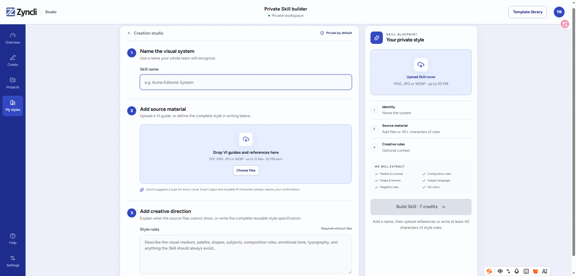
A private visual system should preserve the distinction between source evidence and reusable rules. Zyncli's private visual Skills are designed around that separation: source files inform a structured specification that can be reviewed and reused.
- Color roles: background, primary field, accent, line, and skin tones.
- Shape language: angular, rounded, geometric, organic, or irregular.
- Line and texture: weight, continuity, grain, paper, shadow, and finish.
- Composition: crop, perspective, focal point, whitespace, and density.
- Subject language: how people, products, data, and environments appear.
- Negative rules: gradients, text inside images, photorealism, clutter, or generic icon clouds.
Define the visual grammar
Visual grammar is the set of construction rules that remains stable when the topic changes. It might specify one dominant metaphor per image, large unoccupied background fields, simplified figures without facial detail, and one accent color used only at the conceptual focal point.
Write rules in observable language. Terms such as premium, beautiful, dynamic, or modern are too subjective to test. A reviewer can verify a limited three-color palette, a medium-weight dark outline, or a ban on interface screenshots. Observable rules produce more reliable generation and faster feedback.
Organize the specification by visual decisions rather than adjectives: palette roles, shape language, line and texture, depth and perspective, people, objects, composition, negative space, and exclusions. Add a short quality rubric so reviewers can distinguish a style violation from a weak concept or a generation artifact.
Turn the rules into a production specification
A production specification needs enough detail to guide a scene that does not exist in the reference set. For palette, define roles rather than a list of hex values: which color owns the background, which carries the main subject, which is reserved for emphasis, and how much contrast is expected. For composition, describe the focal hierarchy, preferred crop, whitespace range, and how many competing elements are acceptable.
Subject treatment needs the same precision. If people appear, define age range, body proportion, facial detail, gesture, clothing simplification, and whether groups or isolated figures are preferred. If the system includes diagrams or data, specify how connectors, nodes, arrows, labels, and evidence differ from decorative marks. These rules prevent the model from inventing a new visual language whenever the content changes.
Negative rules should name recurring failures, not every imaginable mistake. A short list such as no gradients, no floating icon clouds, no embedded text, no mascot robots, and no photorealistic faces is easier to enforce than a page of arbitrary prohibitions. When a new failure repeats across briefs, add one general rule and version the specification.
Separate invariants from controlled variation
Not every element should remain identical. Invariants are the decisions that make the work recognizable: palette logic, line language, material, level of abstraction, and treatment of subjects. Controlled variation gives the system enough range for different stories: composition, scale, scene type, and emotional intensity.
If everything is invariant, the library becomes repetitive. If everything varies, the brand disappears. A useful style specification states which properties must remain stable, which may vary within a range, and which are prohibited.
For example, a paper-based system can keep its warm ivory ground, navy structural forms, coral focal accent, flat cut-paper material, and thin charcoal linework invariant. It can still vary the number of figures, scene scale, direction of movement, density, and metaphor. That combination creates family resemblance without turning every article into the same template.
- Keep stable: palette roles, material, line language, abstraction level, and treatment of people.
- Vary deliberately: composition, scale, subject, viewpoint, and emotional intensity.
- Prohibit explicitly: recurring artifacts and visual shortcuts that contradict the brand.
Test the system with deliberately different briefs
Do not validate a style with three nearly identical scenes. Test an abstract concept, a human interaction, a process, a product-related scene, and a topic that does not appear in the reference set. The goal is to discover where the rules stop generalizing.
Compare the results as a collection. Look for drift in palette, perspective, character anatomy, detail density, background treatment, and metaphor quality. Revise the specification when the same failure appears more than once; do not patch every image with an unrelated exception.
The paired examples below illustrate the review method rather than report a controlled product benchmark. The first image in each pair deliberately changes medium and palette; the second applies one paper-based grammar with stable color roles, texture, linework, and negative space. The subjects remain comparable so the effect of system-level decisions is visible.






Use a small quality rubric
A rubric turns brand feedback into repeatable review. Score concept accuracy, composition, style adherence, set consistency, artifact quality, and publication readiness. A visually impressive image should still fail if it contradicts the article or breaks a non-negotiable brand rule.
Version the rules when the brand direction changes. Record which version produced each asset so older campaigns can remain coherent and future generations do not silently inherit temporary experiments.
Use rejection reasons consistently. Mark a failure as concept, composition, style, artifact, or publication issue instead of asking for a vague improvement. If three different images fail for the same reason, the specification probably needs revision. If one image fails while the others pass, regenerate that brief without destabilizing the complete system.
Approve the set only after viewing the images at their real publishing sizes. A system can look coherent in a contact sheet but lose its hierarchy on mobile, or appear consistent at full size while using accent colors too aggressively in a feed. Brand consistency is a publishing outcome, not merely a similarity score between source files and generated images.
- Concept accuracy: does the image communicate the approved editorial takeaway?
- Style adherence: does it follow the observable palette, form, material, and composition rules?
- Set consistency: does it belong beside the other approved images without repeating them?
- Artifact quality: are anatomy, edges, text-like marks, perspective, and object construction acceptable?
- Publication readiness: is the crop, resolution, placement, caption, and alt text ready for the page?
Build from your brand
Turn approved brand evidence into a reusable private Skill.
Upload visual guidelines and reference images, define the rules that matter, and reuse the resulting visual system across future articles.
See how private visual Skills work