If you write and publish your own blog or newsletter, you can finish the draft and still spend the rest of the evening on one missing image. The stock photos match the topic, but none explains the point you made halfway down the page. You open a design tool to make something yourself and get stuck at the blank canvas: what should this picture show? Even once you have it, you have to decide whether it belongs on the cover or next to a paragraph.
The next issue brings another decision. You liked the look of the last one, but this week's subject needs a different picture. You want the two issues to look like they belong to the same publication without using the same cover again.
Zyncli reads your draft, suggests what to illustrate and where, and can generate images in a style you choose. You can use a ready-made template or save a style of your own for future articles. Keep the photos, screenshots, and charts that already work. Bring Zyncli the draft with a gap you still need to fill.
You know what you wrote. You still don’t know what to draw.
You might have a section about why a new process makes work pile up, yet “an illustration about work” gives you little to go on. Even a picture that shows the right people and setting can miss the thing you want the reader to see. The decision you’re stuck on is which part of the paragraph to turn into a scene.
We ran an original newsletter sample through Zyncli to see what it would propose. The draft describes a team that automates part of its work, only to find that everything still waits on the same person’s approval:
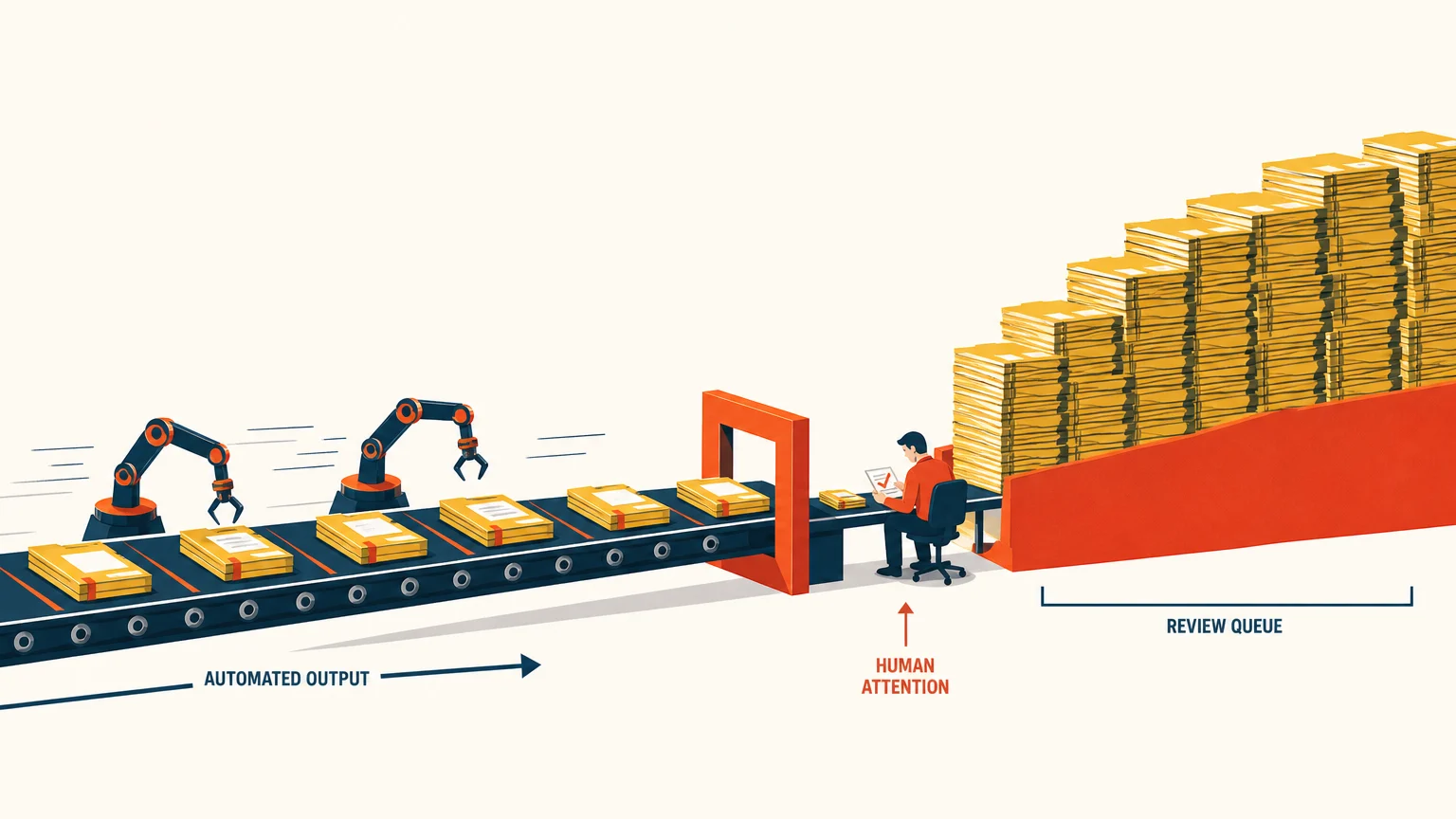
“The bottleneck has moved. Work now reaches the review desk faster, while the reviewer has the same amount of attention.”
Zyncli’s plan called the first image “The Faster Conveyor, the Same Narrow Gate.” The brief proposed a wide conveyor bringing work packets to one inspection point, with a lone reviewer and a growing stack. A photo of a busy office could set the scene. The conveyor gave us a way to show why the queue grows.
You see the proposal before you generate the image. If the scene misses your point, you can edit the brief there. For example, if your draft argues that the reviewer lacks context, a stack of work would suggest the wrong cause. You could change the proposed scene to focus on a reviewer receiving a recommendation without the source document. You’re making an editorial decision about your own argument, and you have a concrete idea to react to.
You have an image, but the cover and the body need different things
A cover can introduce the problem before the reader knows the details. A body image can pick up a specific idea the reader has just encountered. In the newsletter, the conveyor was clear enough to open the issue: one desk, too much incoming work. We used it as the opening image instead of making a separate cover. The next image explained how to handle the work differently. Up top, its two routes would have had little context.
Zyncli’s second brief picked up the part of the draft that proposes a path for routine work and a separate path for exceptions. It suggested a sorting switch, an open lane, and a review desk. The brief quoted the right passage but gave conflicting placement instructions: the section name was right and the sentence it said to follow was in a different section. We put the image under the paragraph that explains the two routes.
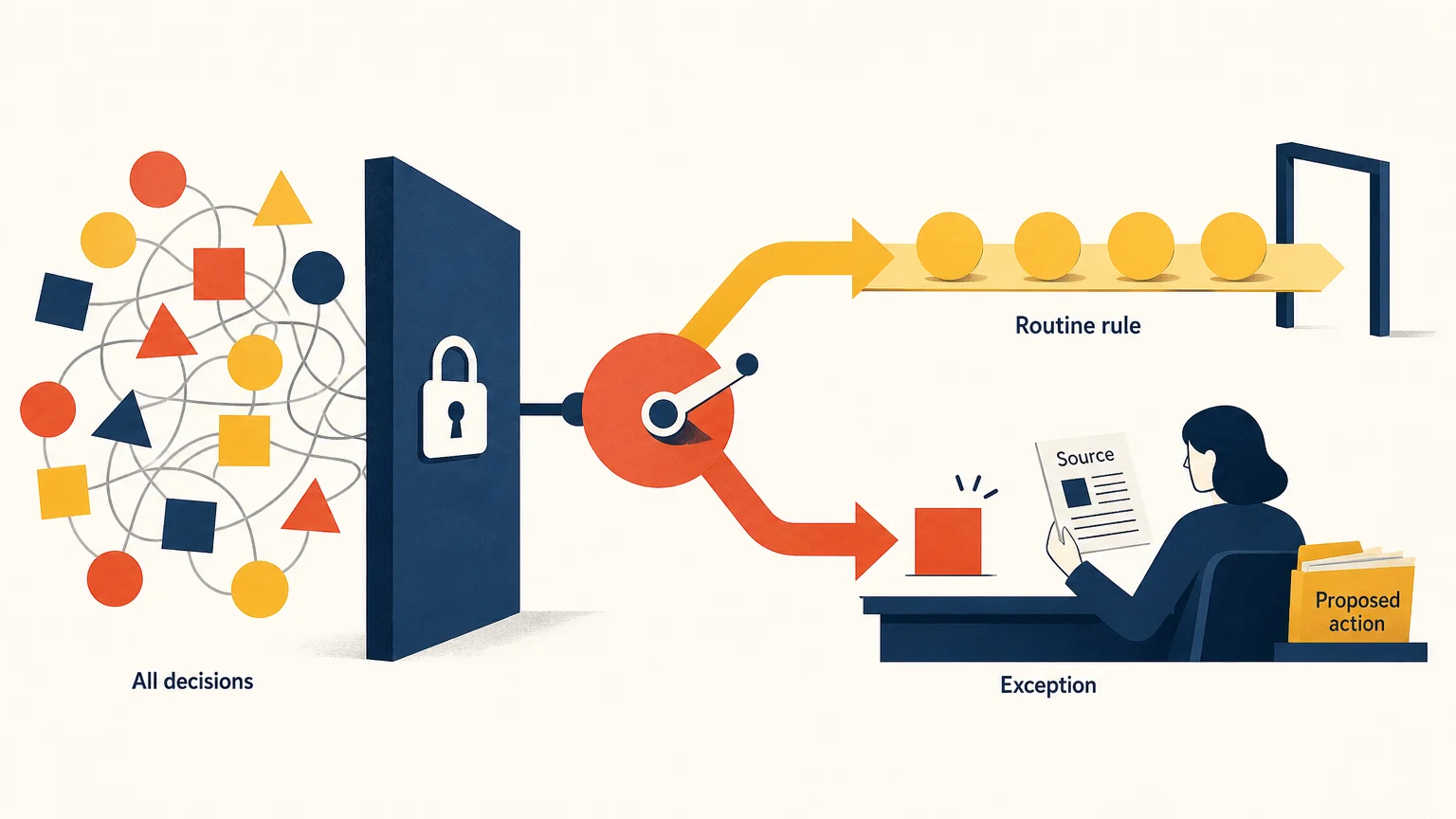
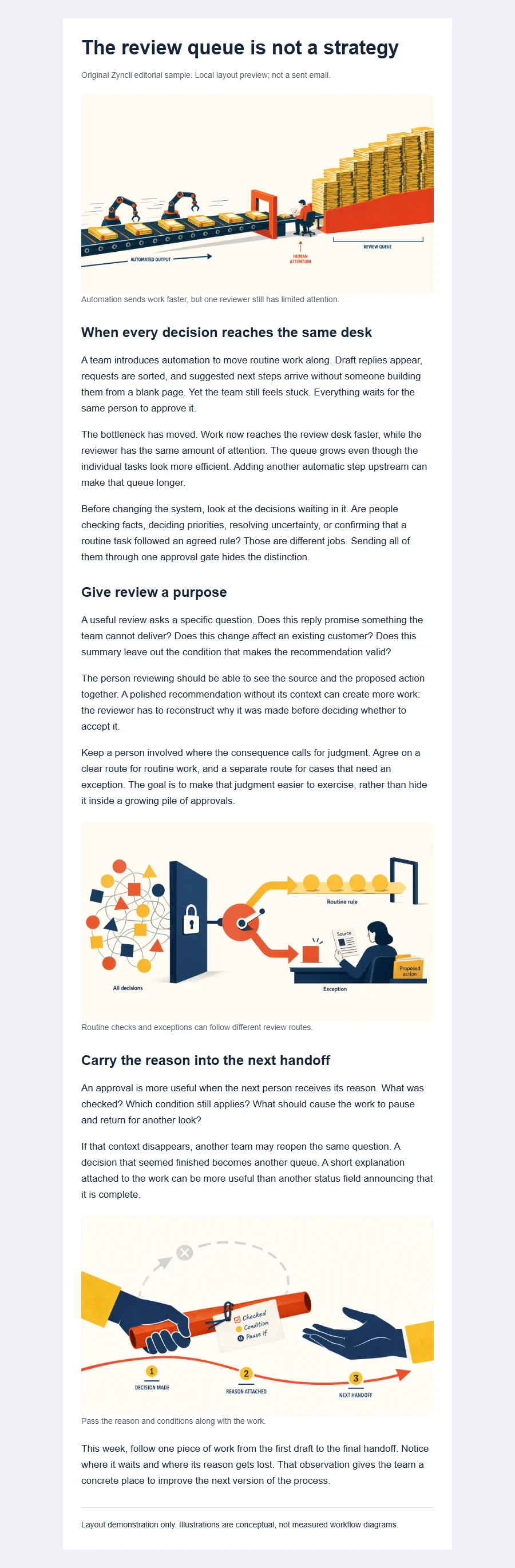
The placement suggestion gives you a passage to look at. You still place the downloaded image in your editor. That check helps if you moved a section after generating the images or if your newsletter tool crops the opening image. In our mobile preview, the small labels in the illustration are harder to read, so the text around it still needs to explain which decisions go down each path.

The photo library has the topic, but it doesn’t have your example
Some images are worth finding or making yourself. If you write about a place you visited, your own photo can show what you saw. A current screenshot can show the exact setting you want readers to find. If you’re reporting how long requests spent in a queue, build a chart from the records so readers can see the dates and values. For a process that needs exact labels and arrows, a design tool gives you control over each one.
The gap in our sample was different. We had an argument about a queue, but no real workplace to photograph and no numbers to plot. We could draw the conveyor by hand or commission an illustration. We could also spend time looking for one with the right combination of objects. With Zyncli, we used the draft to generate a candidate for that specific idea. The same article could have included a real chart elsewhere if we’d had data to report.
You can start with one image if the rest of the post already has what it needs. Review the result against the passage before using it. In the two-route example, the exception has to reach the person at the desk. If both lanes bypass review, the illustration changes the advice. Edit the brief or try another image when the output changes what the reader is likely to understand.
You want the next issue to look like it came from the same publication
Perhaps you made a cover you liked last week, and the file is still open in your design tool. You could duplicate it, but the composition you used for a personal essay may feel forced on a piece about how a team works. Starting over gives you more room and sends you back to picking a palette and a drawing style.
The Zyncli template library lets you choose a visual style by looking at finished examples. Signal Editorial uses crisp shapes and strong color blocks; it fit our sample because the paths and the review desk had to read as separate parts of a process. Paper Notes uses torn edges and layered paper. If you write reflective essays, you might prefer that softer look to the sharp geometry of Signal Editorial.
In our sample issue, both illustrations use Signal Editorial. The cream backgrounds and dark blue shapes tie them together, even though one shows a bottleneck and the other shows a fork in a path. For your next issue, you can select the same template and let the new draft supply the subject. You keep the look without asking a different story to fit last week’s composition.
You already have a look and want to carry it forward
If you’ve been making your own images for a while, you may have choices you don’t want to give up: an off-white background, thin navy lines, and orange reserved for the part the reader should notice. You could start each image with an old file and strip out the previous subject. That works when the layout carries over. It gets awkward when a picture of two people handing off work has to become a close-up of one object.
Zyncli calls a saved custom style a private Skill. You can describe your direction in writing or bring reference images or a brand guide. Zyncli drafts a set of illustration rules for you to review. For the off-white and navy example, you might specify that orange should mark the item that changes hands, while leaving the number of figures and the layout up to the scene. After you approve the rules, you can select that private style for another draft.
Use a new subject to see whether the style carries over before you settle on it for a series. A cover can look right because it happens to resemble your reference. A different scene will show whether the line weight and color treatment still feel like yours. Creating a private Skill requires Creator or Studio and uses analysis credits.
Try it on your own draft
Start with the one picture you’re missing.
Start with one illustration and review the suggested scene and passage before generating it. Planning and generation use credits; the app shows the cost before each step.
Illustrate my article