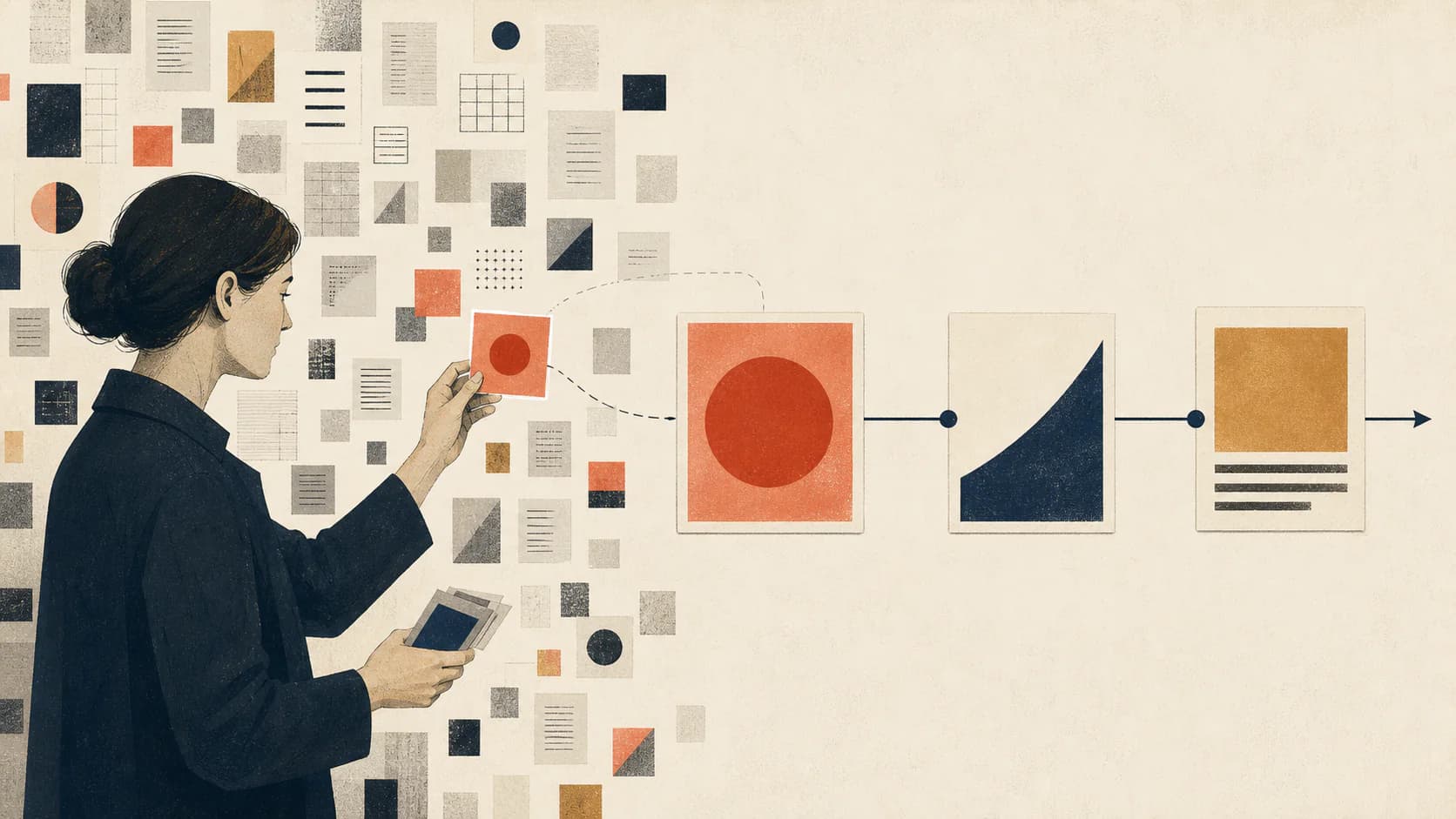
Editorial illustration is visual interpretation created for published writing. Its job is to clarify, frame, question, or make an idea memorable—not merely to decorate the page.
Editorial illustration turns an argument into a visual idea
An editorial illustration is an image created to accompany and interpret published writing. It may appear beside a magazine feature, opinion column, news analysis, essay, newsletter, research summary, or company article. The image responds to the meaning of the text rather than functioning as a generic picture of its subject. This use of the term follows the Quentin Blake Centre's editorial illustration definition, which centers images made for and interpreted alongside published articles.
If an article is about workplace automation, a literal image might show a laptop, robot, or office. An editorial illustration asks a sharper question: what relationship between people, judgment, and automation does the article describe? The resulting image might show a team directing a network of tools, a human hand interrupting an automatic loop, or two systems sharing one control surface. The subject remains recognizable, but the composition expresses an argument.
The five jobs an editorial illustration can perform
Editorial images do not all serve the same purpose. Naming the job before choosing the scene prevents attractive but irrelevant results. A hero illustration can establish the central tension of the article, while a smaller image later in the piece may explain a mechanism or create a deliberate pause.
The strongest visual opportunities usually occur at conceptual turning points: the main claim, an important comparison, a process that is difficult to scan in prose, an unexpected consequence, or the transition from problem to response. Illustrating every concrete noun produces a collection of objects; illustrating these structural moments produces a visual story.
- Frame the central question or point of view.
- Explain a process, relationship, hierarchy, or change.
- Turn an abstract idea into one memorable metaphor.
- Create atmosphere without pretending to document a real event.
- Control reading rhythm between dense sections of text.
Editorial illustration is not the same as decoration or stock imagery
Decoration can improve the surface of a page without adding meaning. Stock imagery can identify a broad subject quickly. Both may be useful, but neither automatically interprets the article. A photograph of people in a meeting says little about a specific argument concerning trust, incentives, management, or remote collaboration.
Editorial illustration becomes valuable when it makes a choice. It emphasizes one relationship, omits irrelevant details, and gives the reader a visual proposition to consider. That choice can be analytical, emotional, humorous, critical, or ambiguous. The image does not need to explain the entire article, but it should be difficult to exchange with the image from an unrelated article.
Editorial illustration is a function, not one visual style
The term describes what the image does, not how it must look. Editorial illustration can use flat geometry, ink drawing, collage, photo-illustration or photomontage, watercolor, 3D objects, diagrams, or restrained synthetic imagery. Documentary photography is a neighboring editorial medium, but it is not automatically illustration. A publication should define when it uses each form.
Flat and geometric systems are effective when clarity and small-screen readability matter. Hand-drawn line work can feel personal and authored. Collage can connect competing domains or historical layers. Three-dimensional forms can make technical topics approachable. Dark cinematic imagery can carry tension, while diagrams are often best when the reader needs to understand a real structure rather than a metaphor.
The important distinction is consistency. A publication does not need every composition to look identical, but the images should share stable decisions about palette, shape language, line, texture, perspective, people, objects, and negative space. Those recurring decisions turn a group of images into an editorial system. The guide to editorial illustration styles compares the main visual languages and their tradeoffs.
A practical editorial illustration process
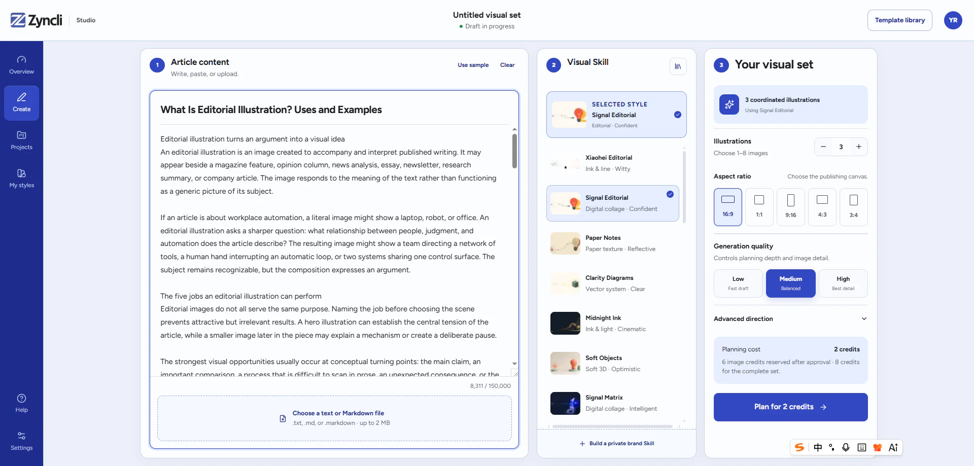
The process begins with the writing, not the image prompt. Read the complete draft and map its structural beats. Mark the moments that need orientation, explanation, contrast, atmosphere, or memory. Then decide how many of those moments genuinely benefit from an image. The right count follows the argument rather than a fixed images-per-word formula.
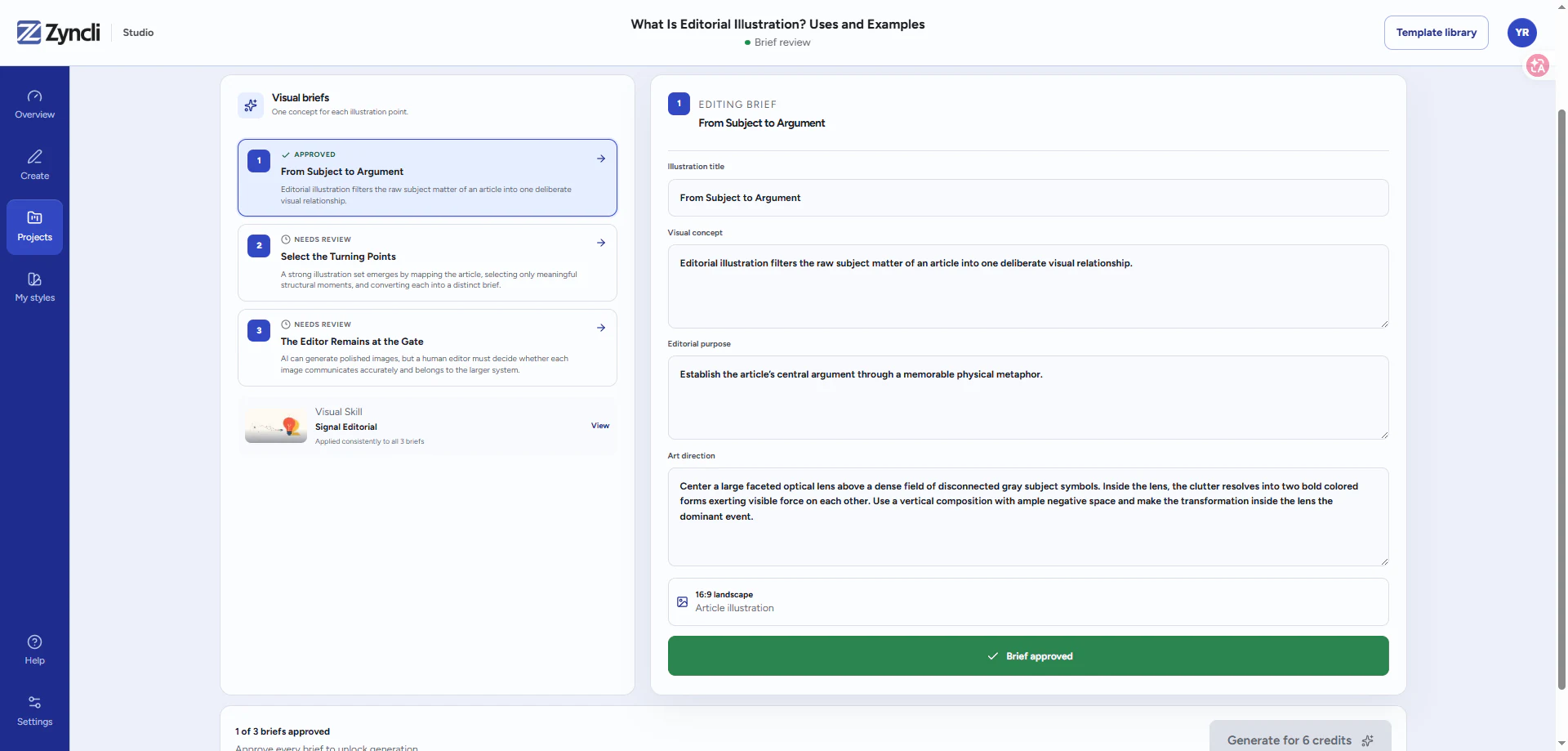
For each selected moment, write a brief that separates meaning from appearance. State the editorial takeaway first. Then describe the subject, visible action, relationship, composition, and intended placement. Apply the visual style after the concept is clear. This order prevents the style from becoming a substitute for an idea.
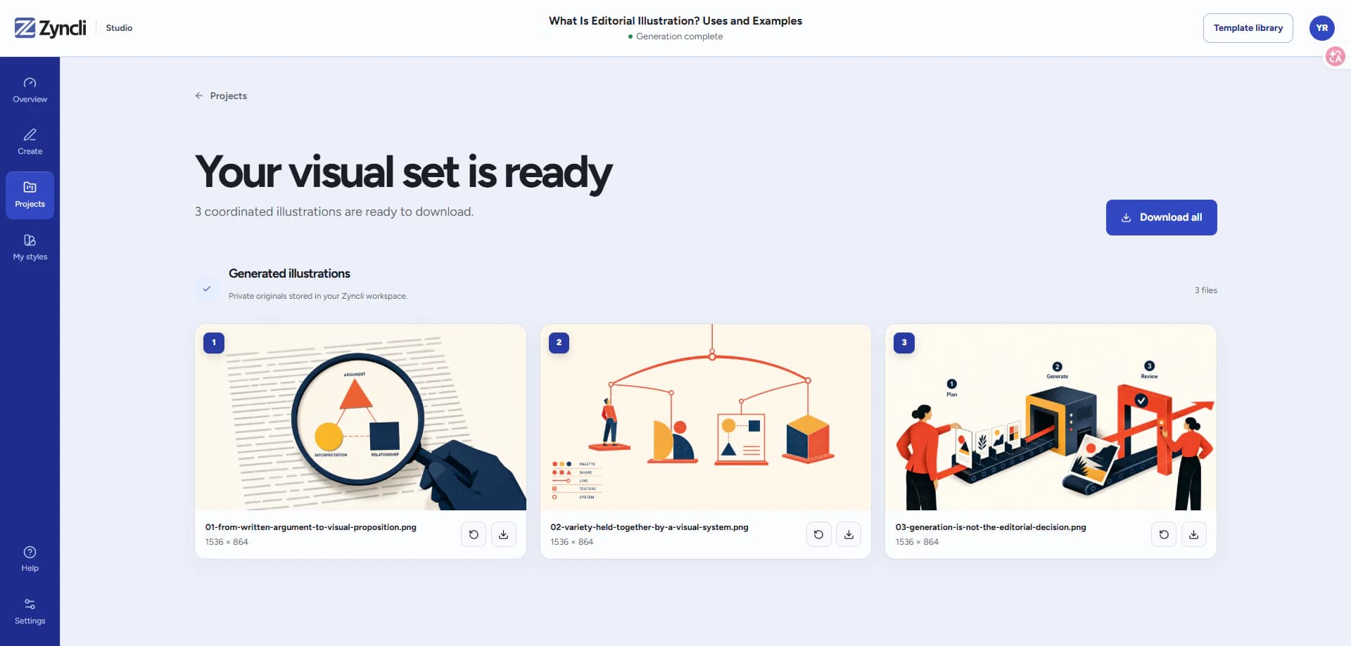
Review all briefs as a set before generating. Remove repeated concepts, vary camera distance and composition, and confirm that each image has a different job. After generation, review the collection again. An individually attractive image may still fail if it repeats another scene, breaks the visual system, or contradicts the article.
For a more detailed production sequence, use the step-by-step article illustration workflow. It covers article mapping, briefing, set review, generation, placement, and alt text.
- Read and map the complete article.
- Select moments with distinct visual jobs.
- Write an editorial takeaway for every brief.
- Describe the scene and composition in observable terms.
- Apply one reusable style specification across the set.
- Review concept accuracy, style adherence, and set-level variety.
Examples of editorial illustration decisions
For an article about AI and human collaboration, a weak direction is a glowing robot beside a person. A stronger editorial direction shows people establishing priorities while automated systems connect and execute around them. The visual relationship makes human judgment—not the robot—the focal point.
For an article about organizational complexity, a weak direction is an office building with gears. A clearer conceptual image might show one simple decision entering a maze of overlapping approval paths. For a personal essay about creative exhaustion, the illustration could use an imperfect ink figure carrying a carefully stacked but unstable collection of unfinished shapes. Each example translates the argument into a visible relationship.
Different visual Skills can interpret the same brief differently. A geometric style may reduce the relationship to shapes and spacing. A character-led system may show a specific human moment. A collage might combine fragments from several domains. The editorial meaning should remain stable even when the visual language changes.
Using AI without losing editorial judgment
An image model can produce a polished picture from a prompt, but it does not automatically decide which moments matter across an article. It also does not know which visual choices belong to a publication unless those choices are made explicit. The production problem therefore has two layers: editorial planning and image generation.
A useful AI workflow keeps those layers separate. First analyze the article and approve the visual briefs. Then compile each approved brief through the same visual specification. That specification should define composition patterns, palette roles, subject treatment, texture, negative constraints, and a small quality rubric. Reusing only a paragraph of style adjectives is not enough to control a complete set.
The final review remains a publishing decision. Check whether the image communicates the intended point, whether factual details are defensible, whether the set feels related without becoming repetitive, and whether the result is suitable for the publication and audience. Generation is one production step; it is not the editor. The same distinction is central to building consistent AI illustrations for a brand.
A checklist for choosing or reviewing an editorial style
Test a candidate style with more than one ideal scene. Use an abstract argument, a human interaction, a process, a data-related concept, and a quiet transitional image. Compare the collection rather than selecting the style that produced one spectacular hero image.
The right direction is the one that communicates reliably across the publication's ordinary topics. It should be distinctive enough to recognize, flexible enough to avoid repetition, and explicit enough that a reviewer can explain why an image belongs in the system.
- Is the central idea clear at both article width and thumbnail size?
- Can the style handle people, objects, processes, and abstract concepts?
- Do the examples feel related without repeating one layout?
- Are palette, line, texture, and subject rules observable?
- Can the style support twenty future articles rather than one campaign?
Plan the complete set
Turn an article into an approved illustration plan.
Paste the finished draft, review the visual moments and briefs, then generate the images you approve in one reusable Skill.
See the article illustration workflow