Built for
All templates
Clarity Diagrams · Explainer
Diagram-Style Illustrations for Explainer Articles
Use diagram-style illustrations to explain frameworks and process relationships. Clarity Diagrams keeps modular forms and labels visually restrained.
No individual image prompts needed. Planning and generation use credits. View plans
Core palette
 Explainer
Visual traits
- Clear hierarchy
- Simple labels
- Modular forms
- Consistent spacing
Output defaults
- 16:9 article canvas
- One concept per image
- Editable visual briefs
Choosing your article images
Is Clarity Diagrams right for your article?
Clarity Diagrams is for a reader who needs to see how a few parts relate. Modular shapes, generous spacing, and a clear visual hierarchy suit comparisons and transformations. These are generated explanatory images, not a diagram editor. Use a dedicated chart or diagram tool when exact connectors, numerical accuracy, or editable components are essential.
A guide comparing two approaches
A clear separation between two structures can express the governing difference. Use surrounding text to name the criteria rather than filling the image with a comparison spreadsheet.
A product education article
One input, transformation, and outcome can make a concept approachable. For instructions tied to actual buttons and field names, pair the image with current product screenshots.
What defines the look
Show the rule that organizes the system.
Clarity Diagrams begins by asking what must remain true across the whole explanation: sequence, hierarchy, exchange, branching, or comparison. Every shape and connector is assigned a job, and anything without a job is removed.
Read the illustration style guideHow scenes are arranged
Focal metaphor
Build one dominant physical metaphor around the article's central relationship.
What stays consistent
- one reading direction
- clear hierarchy
- consistent spacing
- few meaningful connectors
Looks this style avoids
- PowerPoint slide
- dense system architecture
- flowchart symbols everywhere
- dashboard screenshot
How color is used
Palette 1: primary structure and focal subject Palette 2: supporting contrast and secondary forms Palette 3: accent for emphasis and directional cues
Example set
One framework, three levels of explanation.
The module grammar stays constant as the set moves from orientation to mechanism to practical outcome.
AI-generated examples of this style, not photographs of real people, events, or physical artworks.
ExplainerName the starting structure
Give the reader a compact map of the actors, stages, or categories before adding movement.
 Explainer
Expose the transformation
Use routing, grouping, or state change to reveal what the prose says is happening.
 Explainer
Clarify the operating result
Close with the simplified model the reader should be able to remember and reuse.
How it reads an article
It converts prose into a visible model.
A paragraph becomes a starting state, a transformation, and an outcome. A framework becomes a small family of repeatable modules. Labels clarify only what shape and position cannot communicate on their own.
Best fit
Use it for how-to guides, product education, operating models, decision frameworks, and articles that teach a repeatable method.
Choose another style when
Avoid it for stories driven by atmosphere, personality, or visual realism, and for datasets complex enough to require a true charting system.
Before you choose
Questions about Clarity Diagrams
How is Clarity Diagrams different from a presentation graphic?
It limits each image to one editorial teaching job, uses labels sparingly, and composes the system as an illustration rather than a container full of UI chrome, bullets, and decorative icons.
Does Clarity Diagrams export editable diagrams or verified charts?
No. It produces generated illustration files, not native Draw.io diagrams, editable vector nodes, or charts calculated from data. Review labels and relationships before publishing, and use a data or diagram tool for exact documentation.
How do I use Clarity Diagrams for my article?
Paste your finished draft, select Clarity Diagrams, and choose a starting image count. Zyncli proposes image ideas and placements for you to review before generating. You can edit the briefs without writing each image prompt from scratch.
Does using this style cost credits?
Planning and image generation use credits, and regenerating an image uses more. You see the quoted cost before each step. Official styles do not require you to build a private brand style. See pricing for current plans and credit allowances.
From draft to image set
Bring the article.
The style is ready.
You do not need to learn the drawing technique or write every prompt. Choose this style, review the proposed scenes, and generate the images that fit your writing.
Open-source SkillInstall Clarity Diagrams from GitHub- 01
Add your finished draft
Paste the article, choose this style, and set a starting image count.
- 02
Review the proposed images
Zyncli suggests scenes and placements. Edit the visual briefs before generating.
- 03
Generate and inspect the set
Check each result for meaning, consistency, and unwanted details. Regenerate individual images when needed.
- 04
Download and publish
Place the image files beside the relevant passages. Keep accurate charts, real photos, and product screenshots where your article needs them.
Compare the alternatives
When to choose a different style
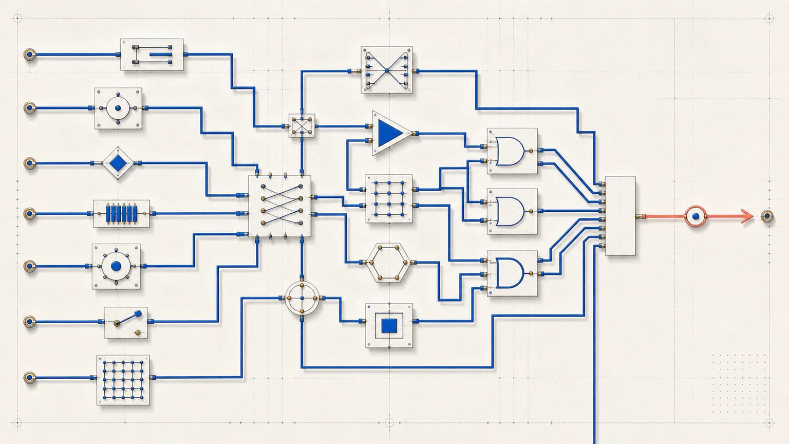
Choose Precision Circuit for orthogonal routes and technical system metaphors with a schematic appearance.
 Explainer
Choose Soft Systems 3D when physical modules and tangible routes will explain the idea more warmly.
 3D
3DReady to use Clarity Diagrams?