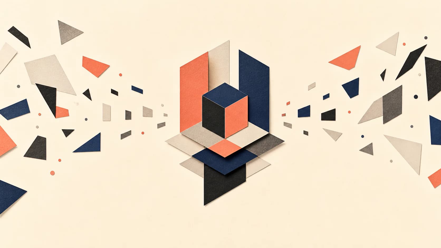
Plan the visual job before generating the image. A coherent set comes from distinct briefs, controlled repetition, and an article-level view of the story.
Step 1: Start with the job of each illustration
Do not begin by asking what image would look attractive beside a paragraph. Begin by asking what the reader needs at that point in the article. The answer may be orientation, explanation, contrast, atmosphere, or a memorable visual metaphor. If the image has no clear job, it is decoration and can usually be removed.
The strongest candidates are often the moments where the article changes direction: the central claim, a difficult mechanism, a comparison, a surprising consequence, or the transition from problem to solution. These moments carry more editorial weight than isolated nouns that happen to be easy to draw.
This is the practical difference between a generic picture and editorial illustration: the image interprets a point in the writing. Write the visual job in one sentence before discussing style. If that sentence only names a subject, it is not yet a useful brief.
- Explain a process or relationship that is difficult to scan in prose.
- Make an abstract argument concrete through one visual metaphor.
- Show a contrast, sequence, hierarchy, or change over time.
- Create a deliberate pause before a major section or conclusion.
Step 2: Map the article before choosing image count
Read the complete draft and mark its structural beats. A typical long-form article has an opening promise, two to five major arguments, supporting examples, and a conclusion. Illustrations should be distributed across those beats instead of clustering near the introduction because the opening paragraphs contain more concrete language.
Image count should follow structure, not a fixed formula. A short opinion essay may need one strong hero image and one conceptual spot illustration. A technical guide may need four diagrams because each stage introduces a new relationship. More images are not automatically more useful; repetition without a new visual job weakens the set.
Make a simple article map with the section heading, the reader's question, the editorial takeaway, and the possible visual job. Then view the candidates together. The map exposes two common problems immediately: several briefs explaining the same point and long sections with no visual change in pace.
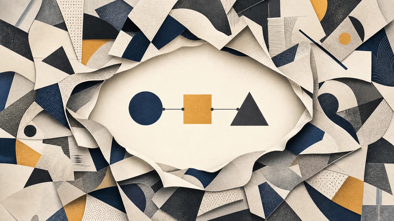
Step 3: Write briefs that describe meaning before appearance
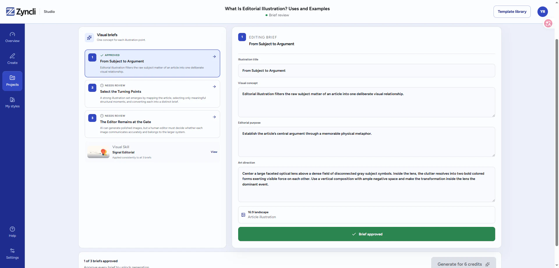
A production brief should separate the editorial idea from the visual treatment. First state the point the image must communicate. Then describe the subject, action, relationship, and composition that could make that point visible. Style, palette, texture, and technical constraints come after the concept.
For example, a weak brief says: make a futuristic AI illustration in blue. A stronger brief says: show a small editorial team directing a network of automated tools, with the people positioned as decision makers rather than passive observers. The second brief gives the image a claim to express and leaves the visual system to control how it looks.
A complete brief should also define what must not appear. For the AI example, exclusions might include humanoid robots, floating dashboards, unreadable interface text, and a passive person watching the system. Negative constraints protect the editorial meaning; they are not merely a list of aesthetic dislikes.
Use the field-by-field structure in the article illustration brief template to record the source context, visual job, constraints, deliverables, and review owner on one page.
- Source passage and intended placement.
- One-sentence editorial takeaway.
- Primary subject and visible action.
- Composition and emphasis.
- Style rules, palette rules, and negative constraints.
- Alt-text intent and any factual details that require verification.
Step 4: Design a set, not a sequence of unrelated prompts
Consistency is more than using the same color palette. The images should share a visual grammar: similar levels of detail, recurring shape language, stable line weight, compatible perspectives, and a consistent approach to people, objects, backgrounds, and negative space.
At the same time, the compositions should not be identical. Repeating the same centered character and floating icons three times creates visual fatigue. Keep the system stable while varying scale, camera distance, spatial arrangement, and the type of metaphor used for each idea. If the style drifts when the subject changes, use the framework for consistent AI illustrations to separate fixed rules from controlled variation.
Step 5: Review the plan before spending image credits
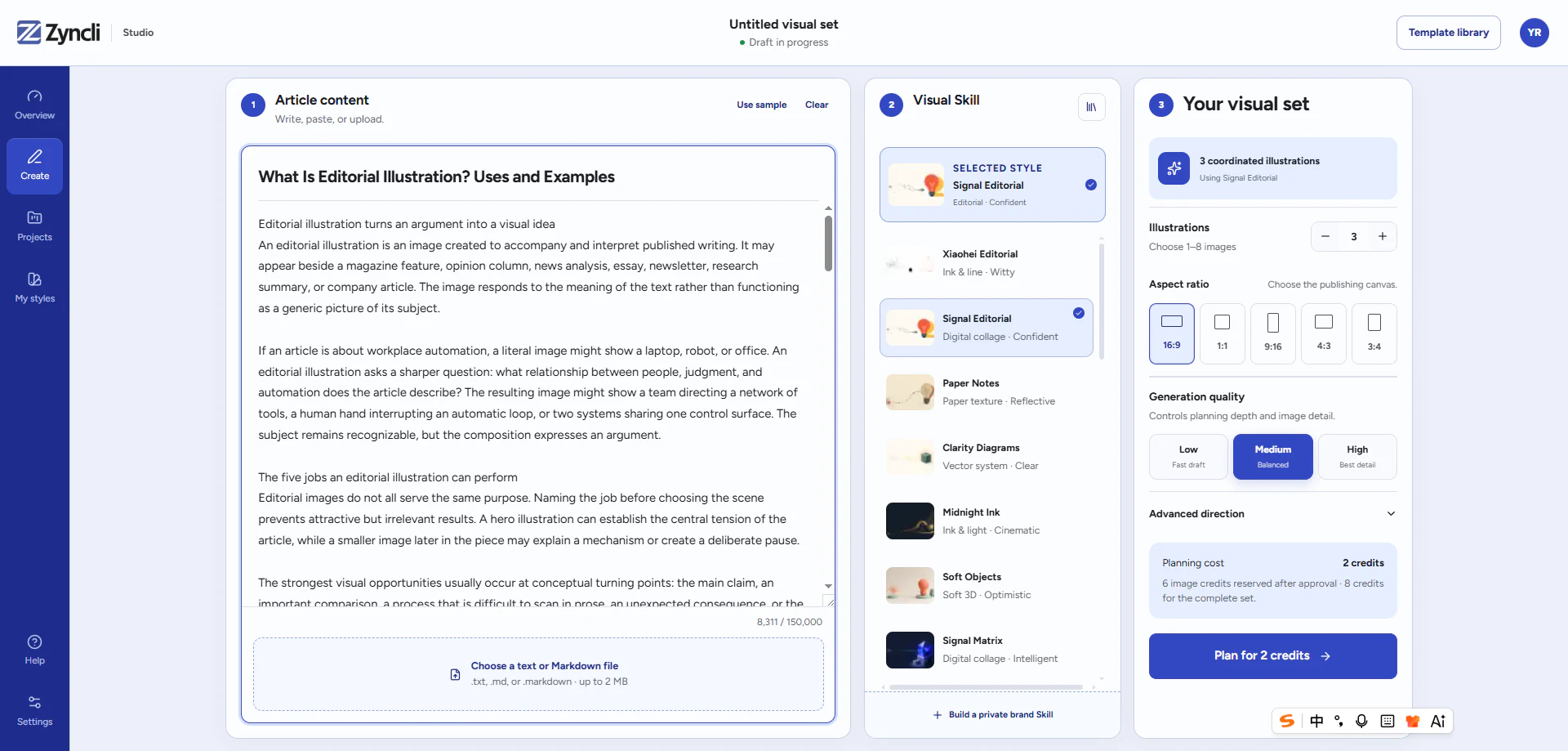
The cheapest point to correct a weak illustration is before it is generated. Review all briefs together and ask whether they cover different ideas, appear at sensible intervals, and belong to the same publication. Remove briefs that merely repeat the headline or turn a sentence into a literal stock-photo scene.
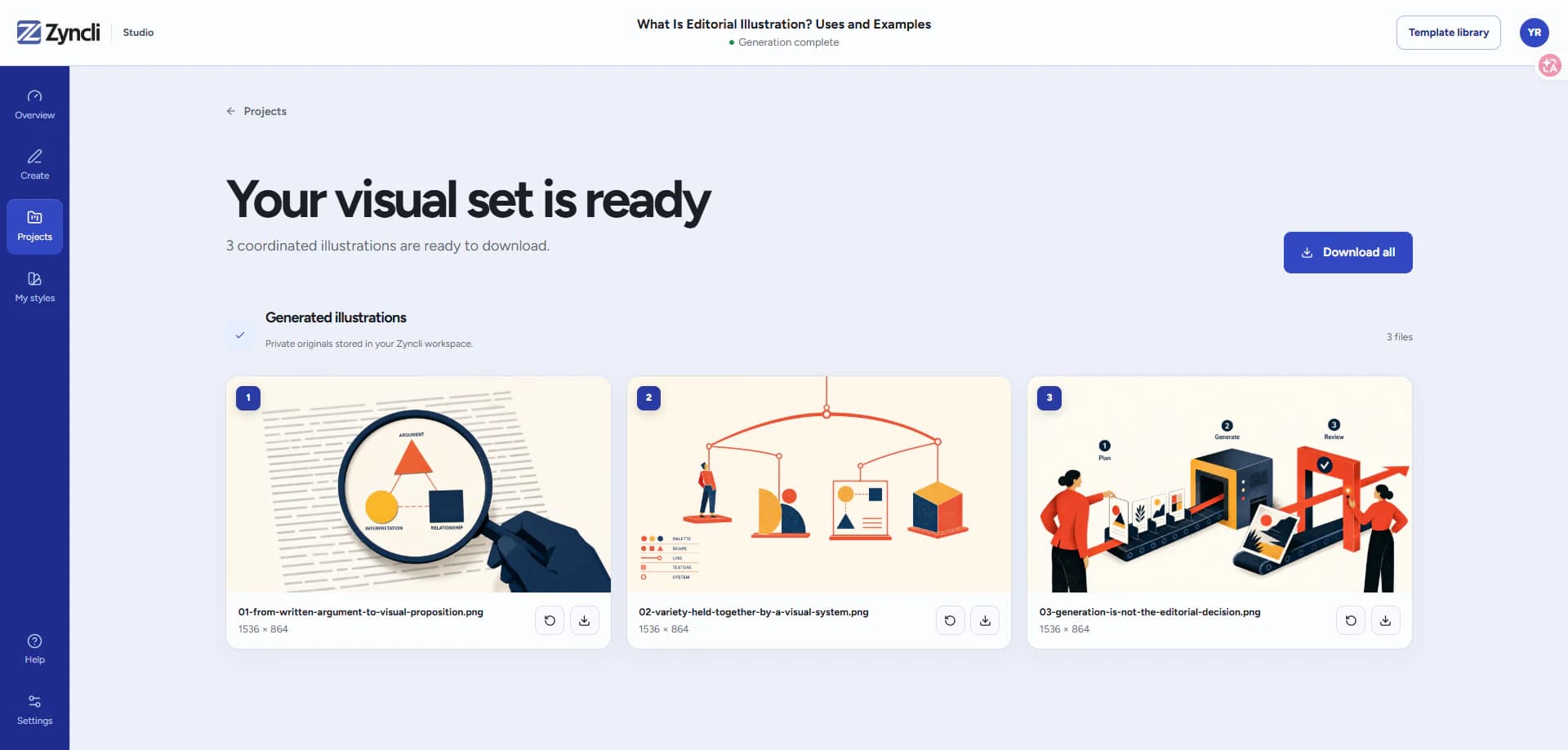
After generation, review the set again rather than approving each image in isolation. A beautiful image can still be wrong if it breaks the visual system or repeats the role of another illustration. Regenerate individual failures without reopening decisions that already work.
Run two passes. In the editorial pass, check concept accuracy, placement, repetition, and whether each image earns its space. In the visual pass, check palette, anatomy, perspective, text artifacts, logos, factual details, and set consistency. Separating the passes prevents surface polish from hiding a weak idea.
Step 6: Publish each image with context
Place each illustration close to the passage it supports, give it stable dimensions to prevent layout shift, and write alt text that describes the useful visual content. Do not force the target keyword into every alt attribute. If the image is purely atmospheric, concise alt text or an empty alt attribute may be more appropriate than a fabricated description.
Keep the original brief, final file, placement, and style version together. That record makes the next article easier to illustrate and turns one successful project into a reusable editorial system rather than a one-off collection of files.
- Do not place the image several screens away from the passage it explains.
- Do not write alt text as a keyword list or repeat the caption word for word.
- Do not publish a generated chart, interface, quotation, or statistic without verification.
- Do not compress every image to one universal size if the layout needs a different crop.
- Do keep the approved brief and style version with the final asset.
Illustrate the complete draft
Plan every visual moment before generating an image.
Zyncli maps the article, creates editable briefs, and lets you approve the complete illustration plan before generation credits are used.
Try the article illustration workflow