
Choose a style by editorial function, range, and repeatability. A strong system must work across the publication's ordinary topics, not only on one ideal example.
Choose for editorial function, not novelty
An editorial illustration interprets an idea rather than merely showing an object mentioned in the text. Style affects how that interpretation feels: analytical, intimate, urgent, playful, technical, or speculative. The choice should support the publication's voice and the kinds of arguments it makes repeatedly.
A style that produces one striking hero image may fail as a system if it cannot handle processes, people, abstract concepts, and quieter supporting moments. Evaluate range and repeatability before visual novelty.
The five examples below start from the same editorial brief: an editor chooses three meaningful ideas from dense source material and arranges them into a sequence. They are style demonstrations, not a claim that one medium is universally better. Keeping the subject stable makes the change in visual language easier to judge.
Compare the styles by what they make easy
A useful comparison starts with editorial jobs, not aesthetic labels. Geometric systems make hierarchy, flow, and abstract relationships easy to scan. Line-led systems make gesture and individual perspective feel authored. Collage handles collision, ambiguity, history, and competing domains. Soft 3D makes mechanisms tangible. Photographic illustration gives conceptual scenes the apparent specificity of a camera while remaining constructed imagery.
The medium also changes the review burden. Geometry needs disciplined metaphor and proportion. Hand drawing needs stable anatomy, line, and imperfection. Collage needs source control and a clear hierarchy. Three-dimensional work needs coherent materials, lighting, and scale. Photorealistic work needs the strongest review for anatomy, factual implication, logos, text, and whether viewers may mistake a conceptual scene for documentation.
Choose the system whose strengths match the publication's recurring work. A product education blog may value diagrams and soft 3D. An opinion publication may need geometric metaphor, ink, or collage. A workplace publication may combine a restrained illustration system with separately commissioned documentary photography, but it should define when each mode is used so constructed imagery is never mistaken for evidence.
- Best for abstract relationships: flat geometry and conceptual collage.
- Best for voice and human gesture: line, ink, and restrained watercolor.
- Best for layered subjects: collage and mixed media.
- Best for tangible processes: soft 3D and diagram-led systems.
- Best for constructed scenes with credible place and action: clearly disclosed photographic illustration.
Flat and geometric illustration
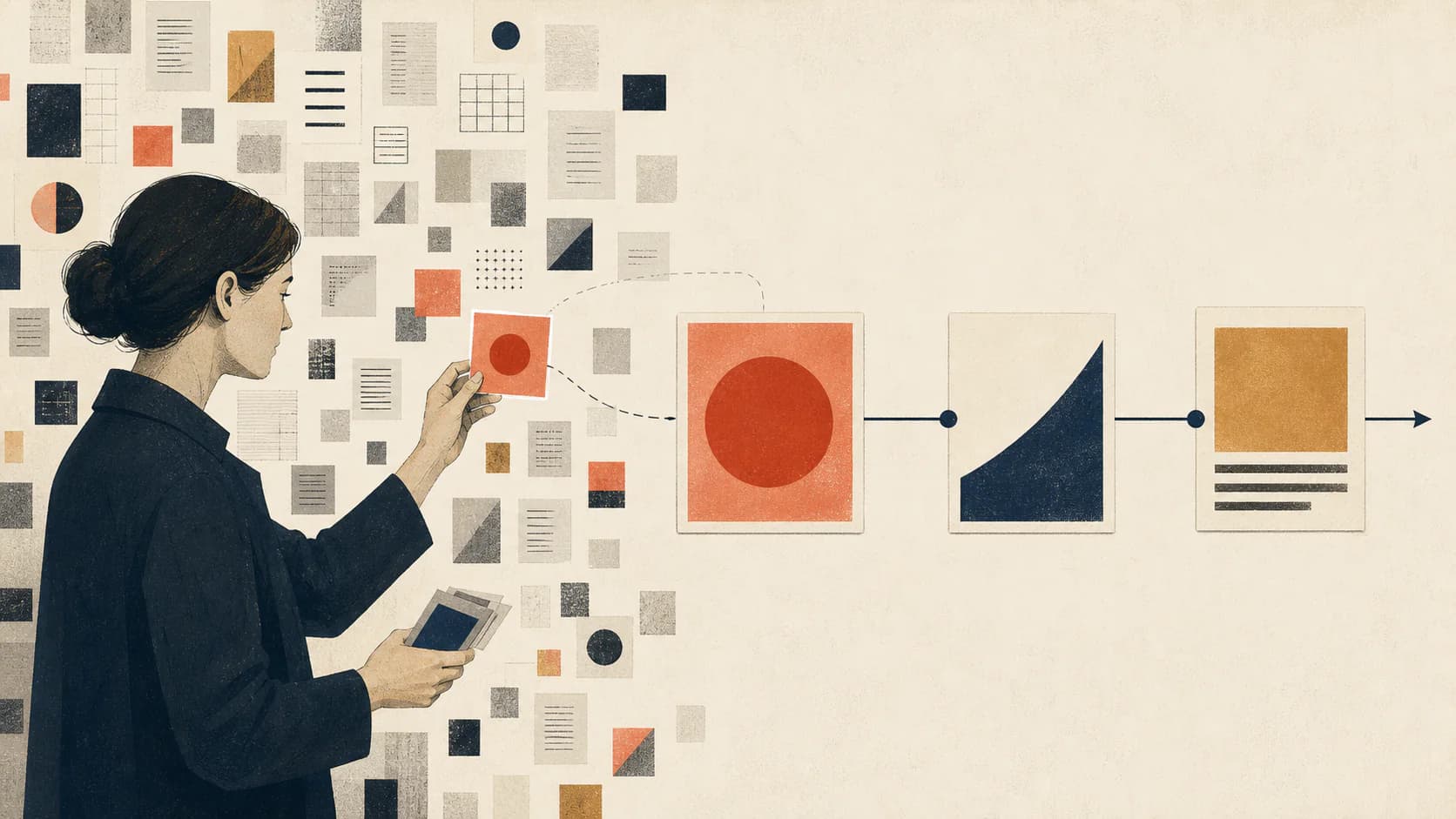
Flat illustration uses simplified shapes, restrained depth, and clear color fields. It is effective for product education, business concepts, and digital publishing because the hierarchy remains readable at small sizes. A geometric system can also express relationships without relying on literal characters.
Its main risk is generic familiarity. Stock-like people, floating interface icons, and interchangeable blue gradients make different brands look identical. A strong flat system needs distinctive composition rules, proportion, palette behavior, and metaphor choices.
Use flat geometry when the article's central idea can be expressed through direction, balance, obstruction, scale, or sequence. Avoid it when the subject depends on subtle facial emotion, material evidence, or a specific place. The medium should simplify the argument, not flatten away the detail that makes it meaningful.
Line, ink, and hand-drawn systems
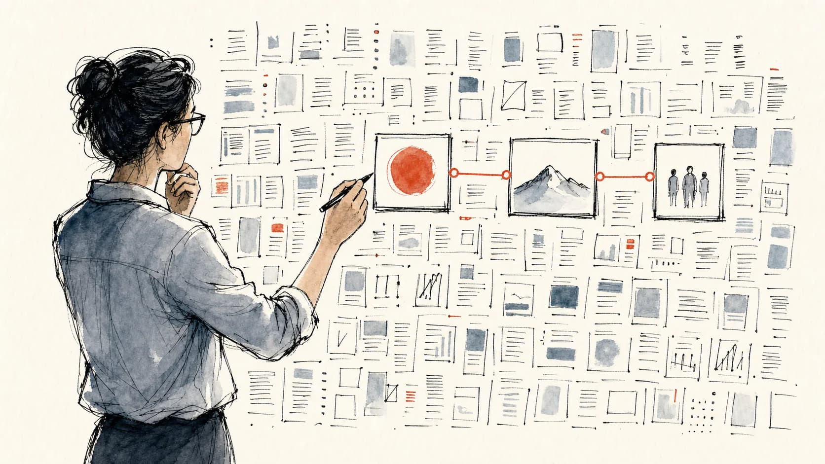
Line-led illustration can feel authored, direct, and human. It suits essays, culture, wellbeing, education, and opinion writing where emotional precision matters more than visual polish. Restrained spot color can provide hierarchy without losing the hand-made character.
The system must control line weight, texture, anatomy, and the amount of imperfection. Random wobble does not create authenticity. Repeated marks and compositional habits are what make the work feel like one illustrator rather than a collection of filters.
Use line and ink when the publication benefits from a visible point of view. It can carry uncertainty, humor, tension, and intimacy without adding many objects. Avoid treating hand-drawn style as a synonym for casual; the strongest systems are tightly art-directed even when every contour appears spontaneous.
Collage and mixed-media illustration
Collage is useful when an article combines multiple domains, historical layers, or competing ideas. Cropped photography, paper, type fragments, scanned texture, and geometric forms can create conceptual tension quickly.
Because collage contains many visual ingredients, it needs strict constraints. Define source treatment, edge quality, texture density, shadow behavior, and whether photographic faces are permitted. Without those rules, each image can appear to come from a different campaign.
Use collage when juxtaposition is part of the argument: old and new, human and machine, policy and lived experience, or several systems sharing one consequence. Give one relationship priority. If every fragment demands attention, the composition reproduces the complexity instead of interpreting it.

Three-dimensional and sculptural illustration
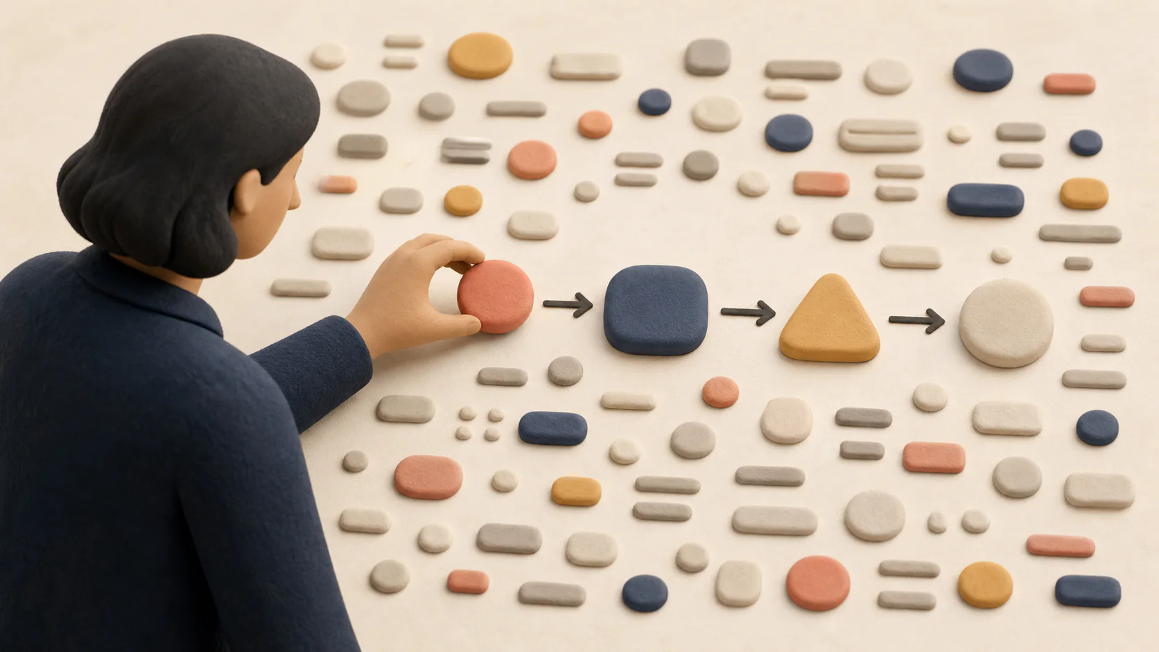
Soft 3D, clay, and sculptural styles can make technical or operational subjects approachable. They work well for product stories, beginner education, and optimistic workplace content. Material and lighting provide a strong recurring identity across a set.
The tradeoff is conceptual precision. Decorative objects can replace a meaningful visual argument, and overly polished lighting may push the work toward advertising rather than editorial interpretation. Use 3D when material form adds meaning, not simply because it looks expensive.
Use 3D for routing, assembly, transformation, weight, volume, and physical choice. Define one material family and a stable lighting setup across the set. Avoid floating collections of attractive objects that have no causal relationship; they create mood but do not help the reader understand the article.
Photographic illustration and synthetic editorial imagery
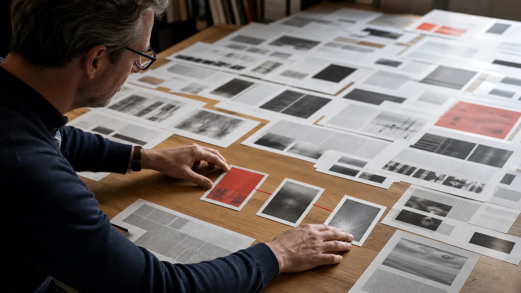
Photographic illustration can carry atmosphere, specificity, and human stakes while depicting a constructed concept rather than a documented event. It suits narrative features, future scenarios, and subjects where place or material detail matters. It also demands the most scrutiny because viewers read camera-like imagery as evidence more readily than abstract illustration.
Avoid using synthetic documentary imagery to imply that a real event, person, or product was photographed. For conceptual editorial use, make the art direction and context clear, and review anatomy, text, logos, cultural details, and factual implications before publishing.
Use a photographic-illustration direction when the story depends on work being performed, a place being inhabited, or an object being handled. Direct the action rather than the pose: an editor arranging evidence is more specific than a person smiling beside a laptop. Label generated work as conceptual imagery wherever a reader could otherwise infer documentation.
Use a five-brief selection test
Before committing to a style, run the same five representative briefs through each candidate: one abstract argument, one human scene, one process, one data-related idea, and one quiet transitional image. Compare the collections, not the single best result.
Choose the direction that communicates most reliably, has enough range for future topics, and can be reviewed with explicit rules. The winning style should make ordinary publishing easier. If it works only on spectacular prompts, it is a campaign treatment, not a reusable editorial system. Once selected, document it using the framework for brand-consistent AI illustrations.
Score each test from one to five for concept clarity, small-size readability, style adherence, range, and production risk. Do not average away a critical failure. A style that scores well overall but cannot represent the publication's most common subject is the wrong system. Keep the contact sheet and review notes so future changes are based on evidence rather than taste memory.
- Does the central idea remain clear at article width and thumbnail size?
- Can the style handle both people and abstract concepts?
- Do the images look related without repeating one composition?
- Can a reviewer explain why an image belongs or does not belong?
- Can the system survive twenty future articles, not only today's topic?
Compare working visual systems
Test a style across the stories you actually publish.
Explore reusable visual Skills with explicit palettes, composition rules, subject treatment, and original example outputs.
Browse the visual Skill library