Built for
All templates
Ink Passage · Illustration
Ink-Wash Illustrations for Reflective Essays
Explore ink-wash illustrations for reflective essays about change and uncertainty. Quiet fields, architectural passages, and a small color cue suggest a route.
No individual image prompts needed. Planning and generation use credits. View plans
Core palette
 Illustration
Visual traits
- Ink wash
- Architectural passage
- Large quiet fields
- One color cue
Output defaults
- 16:9 article canvas
- One concept per image
- Editable visual briefs
Choosing your article images
Is Ink Passage right for your article?
Ink Passage gives uncertainty a space to move through. Washes soften the surroundings while an opening, bridge, or architectural route gives the composition a direction. The style suits an essay whose conclusion is tentative rather than triumphant. It leaves room for the reader to interpret the scene instead of turning the article's thought into a fully labeled diagram.
An essay about an uncertain next step
A partly defined passage can suggest movement without pretending the destination is settled. A restrained color cue can mark the choice the writing is considering.
A cultural reflection on transition
Architectural space can carry the relationship between what is left behind and what opens ahead. Use actual location images separately if the essay describes a specific place.
What defines the look
Leave uncertainty around a legible passage.
Ink Passage does not illustrate an entire landscape. It gathers wash, dry brush, and diluted color around one threshold, corridor, or shelter so the article's movement becomes spatially clear.
Read the illustration style guideHow scenes are arranged
Focal metaphor
Build one dominant physical metaphor around the article's central relationship.
What stays consistent
- one passage or threshold
- ink density carries hierarchy
- edges vary naturally
- one directional cue
Looks this style avoids
- traditional landscape imitation
- zen cliché
- calligraphy poster
- random ink splash
How color is used
Palette 1: primary structure and focal subject Palette 2: supporting contrast and secondary forms Palette 3: accent for emphasis and directional cues Palette 4: restrained supporting accent
Example set
A quiet sequence from fragmentation to passage.
Ink density and paper remain constant while the threshold changes from hidden to approached to crossed.
AI-generated examples of this style, not photographs of real people, events, or physical artworks.
IllustrationHold the fragments apart
Open with separate ink fields that make the lack of orientation visible.
 Illustration
Reveal the narrow passage
Introduce one route or aperture and use the accent color only to direct attention.
 Illustration
Arrive without filling the page
Resolve the movement with a calmer structure while preserving meaningful empty paper.
How it reads an article
It reads for emergence and changed orientation.
Confusion can become separated ink planes with a narrow crossing; recovery can become a washed field opening into a stable chamber. The untouched paper is part of the argument.
Best fit
Use it for reflective essays, change, uncertainty, culture, creative practice, and transitions that benefit from visual quiet.
Choose another style when
Avoid it for procedural explainers, exact systems, urgent marketing, or stories whose value depends on specific people and places.
Before you choose
Questions about Ink Passage
How can an ink wash explain without becoming vague?
The medium may remain atmospheric, but the composition cannot. One threshold, route, or chamber gives the reader a concrete spatial relationship while ink behavior carries uncertainty around it.
How is Ink Passage different from a dark ink illustration?
Ink Passage relies on quiet washes, open fields, and a readable architectural route. A dark ink direction usually emphasizes concealment and high tonal contrast. Choose this style for contemplation rather than suspense or a dramatic reveal.
How do I use Ink Passage for my article?
Paste your finished draft, select Ink Passage, and choose a starting image count. Zyncli proposes image ideas and placements for you to review before generating. You can edit the briefs without writing each image prompt from scratch.
Does using this style cost credits?
Planning and image generation use credits, and regenerating an image uses more. You see the quoted cost before each step. Official styles do not require you to build a private brand style. See pricing for current plans and credit allowances.
From draft to image set
Bring the article.
The style is ready.
You do not need to learn the drawing technique or write every prompt. Choose this style, review the proposed scenes, and generate the images that fit your writing.
Open-source SkillInstall Ink Passage from GitHub- 01
Add your finished draft
Paste the article, choose this style, and set a starting image count.
- 02
Review the proposed images
Zyncli suggests scenes and placements. Edit the visual briefs before generating.
- 03
Generate and inspect the set
Check each result for meaning, consistency, and unwanted details. Regenerate individual images when needed.
- 04
Download and publish
Place the image files beside the relevant passages. Keep accurate charts, real photos, and product screenshots where your article needs them.
Compare the alternatives
When to choose a different style
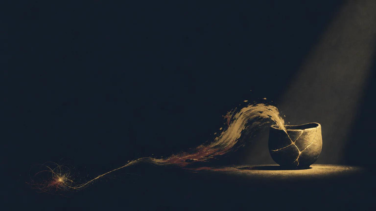
Choose Midnight Ink when selective light and hidden structures need a more tense, investigative atmosphere.
 Atmospheric
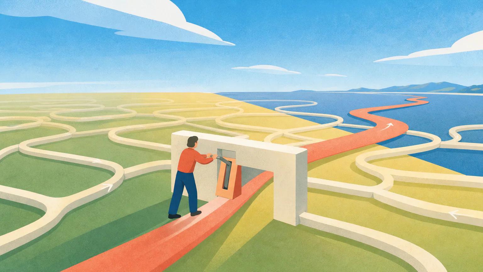
Choose Sunlit Editorial for a brighter, more expansive landscape with stronger matte color fields.
 Editorial
Ready to use Ink Passage?